In this article, we're going to be looking at how to build a conversion-focused practice website.
What does that mean?
Basically, it means a website that will convert browsers into clients for you.
This article will:
- Give you the confidence to build your own website
- Point you in the right direction if you're considering building your site without being prescriptive about what hosting/builder you choose to use
- Get you thinking about and focusing on the things that really matter so that your website works as hard as it possibly can for you
The Referral Process
Before we begin, it's important to understand how new customers are referred into your practice. The diagram below is my working assumption. In essence, all I’m really saying here is that the vast majority of NEW referrals to your practice (regardless of channel) will route through your website. You may receive a handful of direct referrals where they never look at your site but my assumption is that this will be a very small proportion and likely to get ever smaller.
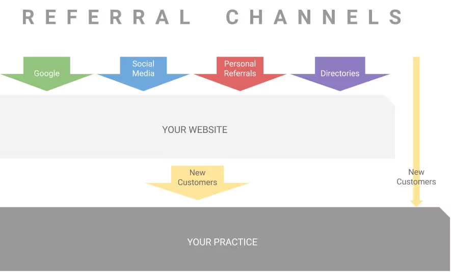
If you agree with this working assumption read on. If you don’t, you’re probably not going to find the rest of this article very useful.
Why “conversion-focused”?
People use all sorts of words to describe websites, like: professional, beautiful, formal, simple etc.
Unfortunately, these descriptions place way too much emphasis on what it looks like and nowhere near enough on what it's there to do, which is to CONVERT.
But what is conversion?
Very simply, it's the action or actions that you would like a visitor to undertake when they visit your website. So, if I were running a practice I would focus on just two conversion criteria:
- Getting the user to make a booking - this would be your primary conversion criteria and is aimed at those people that are committed to getting treatment.
- Getting the user to leave their email address - this would be your secondary conversion criteria for those people that are still in “research mode”. Doing this should enable you to build an opted-in mailing list that you can share your expertise with - more on this later!
This might seem blindingly obvious but many practice websites I see fail to focus on conversion. They tend to be VERY text heavy, incoherent and badly structured. As a result, they don’t provide the content that the visitor needs to convert and this happens:
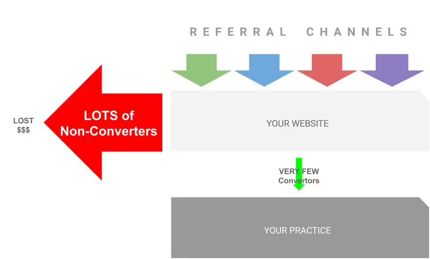
In short, they hit your website, stay for a few seconds and then move on, which is lost opportunity and lost income.
The Conversion Journey
By defining your conversion criteria before you start thinking about building your website you will focus your mind on what really matters and it should make it easier to work out what information you need to drive conversion.
The table below offers some ideas on the kinds of information that you might want to present on your website to help visitors convert. I should stress that these are in no way definitive - they’re my thoughts (as a consumer) on what I would want to know before converting.

Depending on your level of competence, there are other more sophisticated things that you can do to help you determine the factors that cause someone to convert on your website like heatmaps and eye tracking but in the first instance I would focus on a couple of simple and obvious criteria.
In addition, I’d keep these points in mind:
- From the point when your site loads the average user will make a decision to continue reading in under 5 seconds so whatever you choose to say/display at the top of your page, you need to make sure it counts
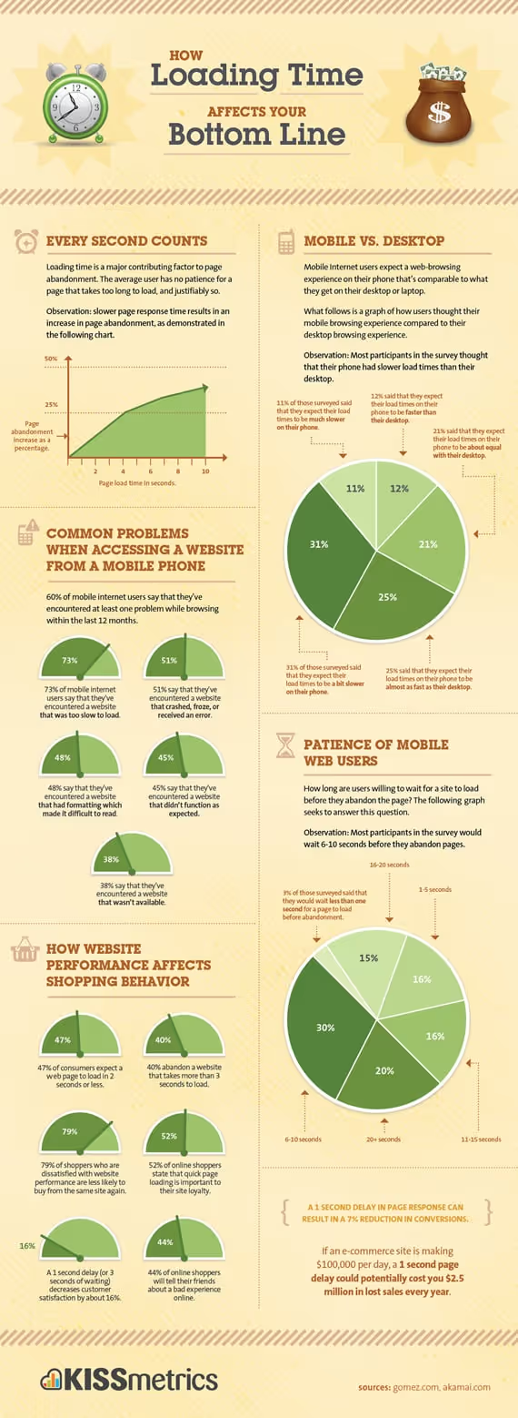
- If your site loads slowly (i.e. > 3 secs) the user will go elsewhere
- If your site isn’t mobile friendly the user will go elsewhere
The (Self) Build
Given the background to this article I’m going to concentrate on self-building your website. Obviously there are tons of other ways to build a site but as I mentioned at the outset, this article is for those of you that haven’t had the greatest experience with web developers and want to go it alone.
Before you dive in, step back
When you start down the route of self-building your website the very natural (and exciting) inclination is to dive in, choose a platform and get building. Please don’t do this. I’ve done it and in my humble opinion it's not the way to go.
Instead, step back, grab a sketch pad (or whatever you use for doodling) and rough out what you think you will need in your site. Below is a simple starter for ten :-)
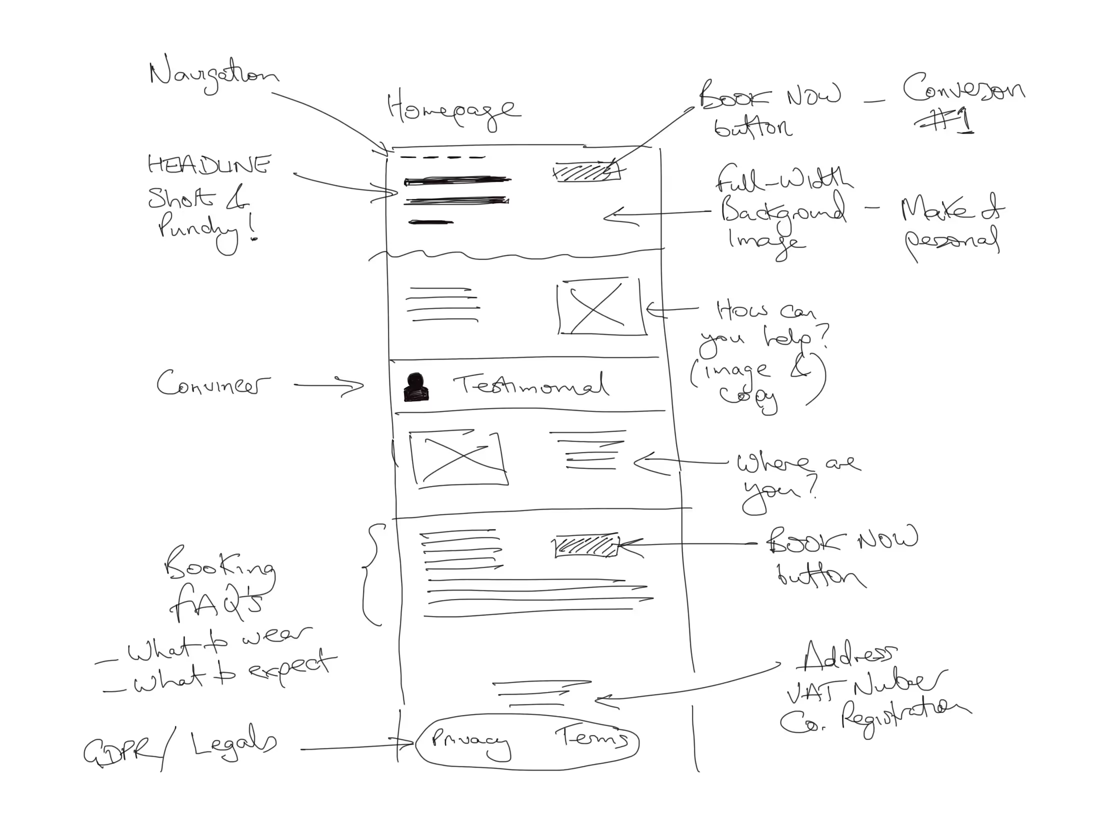
At this point think about:
- Your headline - this needs to be punchy, descriptive and attention grabbing
- The 3-4 important sub-points that you’re going to say to get users to convert and the rough copy associated with each. Please AVOID being excessively verbose. I know its hard and again I’ve been there but spend the time to try and keep the number of words to a minimum
- Structure - Decide if you’re going to have one continuous page or multiple pages? There are merits to both but my feeling in this context is that unless you’ve got a lot to talk about I’d stick to a single page
- Navigation - How do you want users to navigate around your site? This is a bigger issue if you’re going for multiple pages but my strong advice would be to keep it simple and logical. You might think that people will read every bit of text on your site but in reality they won’t. If you retain their interest for longer than 60 seconds you will have done extremely well.
- Placement of links/conversion actionsPositioning of buttonsForms to capture email addresses
- Statutory stuff that should be on your website Privacy Policy Terms of Service
- Cancellation Policy
- Company Number
- Company Address
- VAT number
Going through this process will also help you to work out what you need from your chosen builder.
Choosing a Builder
There are lots of good website building tools out there and I guess it comes down to personal preference. The two that I’ve used on everything from landing pages to personal sites are Wix and Wordpress but I also hear good things about Squarespace.
If you’re the kind of person that likes to research your buying decisions I’d highly recommend checking out YouTube for reviews and comparisons between the builders that are out there.
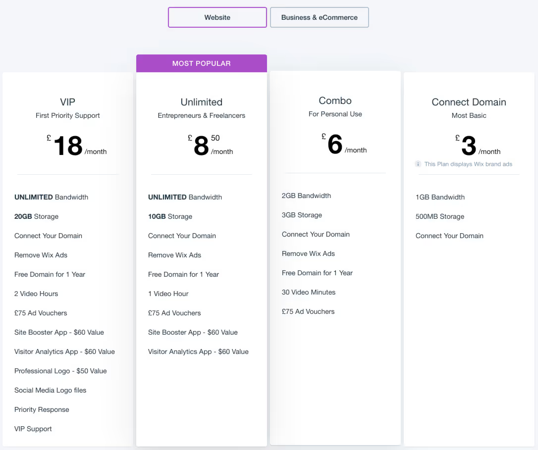
Keep in mind that these tools are almost always provided as part of a hosting package but as you’ll see below (this is from Wix) they are very cost effective:
Before you get started with your chosen builder
I probably sound like a stuck record but once you’ve chosen which builder/hosting service you’re going to use, please don’t dive straight in.
I say this because often what happens if you do this, is you get bogged down by the minutiae of doing something insignificant like positioning an element. A few days pass by and you look at what you’ve achieved and wonder where all the time went. This in turn leads to frustration at the lack of progress and your enthusiasm quickly wanes - or at least mine did!
Start by spending some down-time (before clinic or during your lunch break) watching “getting started” tutorials on YouTube for your chosen builder. All of the major vendors provide their own video tutorials but often the best ones are those that have been created by third-parties as they tend to give you a warts and all view.
Once you’re confident that you’ve got a good idea about how to use your chosen builder grab your rough notes and start building.
Considerations during the build
As I mentioned above there are lots of great tutorials out there that will help you with the mechanics of building your site but what they won’t tend to cover is the content and structure.
Below are a few important considerations that you should keep in mind while your building your conversion-focused site:
- Keep it simple & predictable - you might be tempted to be all edgy and arty. Don’t! The primary purpose for building your site is to get conversions. If it's not instantly obvious what you do and what you’re about you’ll end up being that site (described above) that only converts 1 in 100 visitors. This doesn’t mean your site should be boring or samey but just keep in mind that you’re in healthcare and your site needs to look like a healthcare site.
- Make it personal - many builders allow you to insert free imagery from sites like unsplash - this really helps to provide your site with a professional appearance but bear in mind that there are a limited number of images that relate to physiotherapy or acupuncture and so you might find that another practitioner ends up having the same image on their site. To avoid this and to make your site more personal I’d consider spending a small amount (£250-£500) on getting a professional photographer to shoot some personal footage of your clinic, your treatments, you and/or your team.
- Keep it concise - all too often I visit practice sites that have huge blocks of text on them. It's a shame when someone has spent a long time writing it but it's seldom (if ever) going to be read. The reasons most people tend to write too much copy are:A compulsion to cover everything - you don’t need to. Be brave and focus on the few things that you defined in the planning stage that will be critical to conversion. It's VERY HARD being concise. This quote from Pascal, the mathematician, says it all: “I have only made this letter longer because I have not had the time to make it shorter." If you constantly keep in mind that the reader is short of time and in reality more likely to scan your copy than read it, you’ll be starting from the right place.
- Keep the structure simple - Unless you have a very complex practice offering tons of diverse services in a lot of locations my feeling would be that a single page site would suffice. Again, there is a tendency to go down the route of creating multiple pages for Team, Treatments, Pricing, Locations, Contact Us etc but in reality these pages seldom get touched. Even on the WriteUpp site (pre 2020), Analytics data confirmed that less than 10% of visitors hit our sub-pages.
- Use the available templates - most builders provide a whole host of fabulous templates or themes. In tools like Wix and Squarespace these tend to be organised by industry type but don’t be afraid to use templates from other industries. In my experience the themes aimed at designers tend to be very clean and easy to work with. If you go down the Wordpress route there is a thriving WP Theme market but keep in mind that a bit more technical competence might be required to use them.
- Speed is critical - lots of research has been done on the impact of website load times on conversion so rather than regurgitating it all here's a really useful infographic that tells you everything you need to know:
- Make sure your site is mobile friendly - Based on usage data from our online booking platform, in September 2019 just over 70% of all sessions came from mobile devices or tablets. This may come as a surprise but sometimes we detach our own personal experiences (of using our mobiles all the time) from our impression of the typical user visiting our website. The bottom line is that the vast majority of people visiting your site will be doing so on mobile device. Most leading builders provide you with tools to build a mobile variant of your website. Typically the way this works is you can switch between a mobile variant and a desktop variant and design them accordingly. Even though (based on the data) there's a credible argument to say that you should start building your site with mobile in mind, it's probably better to begin in desktop mode and then decide which assets/copy you want to use in the mobile variant. Again, keep in mind the size of a mobile device and the use-case. No one wants to be scrolling down endless blocks of text on their mobile when all they want to do is book an appointment. Keep the mobile content short and concise.If you would like to read more on this subject, check out my article "If your website isn't mobile friendly you're losing income"
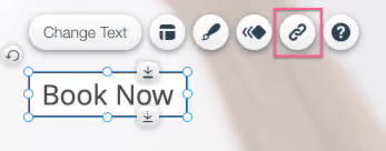
- Conversion Actions - Unsurprisingly, a critical consideration when building a conversion-based website is making sure that it's easy for people to convert. If your primary conversion action is to get people to book an appointment you can simply add a button (or multiple buttons down the page) and link them through to your booking engine. When you do this I‘d experiment with different text and/or colours to see which combinations produce the most conversions.
With regard to your secondary conversion criteria you will find that most of the leading builders provide integrations with the more popular email marketing platforms. This enables you to embed a simple email form in your site which you can then use to capture email addresses and add them to your mailing list(s) for future email marketing campaigns. Our personal favourite is Mailchimp, which ensures that you stay on the right side of all of your GDPR responsibilities but there are lots of other providers out there. Integrating your website platform/builder and your email marketing tool is generally very straightforward. In Wix, linking to something like Mailchimp involves a few mouse clicks to link your two accounts and then a little work with your builder to add the email capture form to your website.
IMPORTANT: You may be tempted to add more actions (conversion-oriented or not). My advice would be to limit the number of things that you ask visitors to do on your site. If your primary objective is to get bookings presenting lots of other things will almost inevitably distract the user from the thing that you really want them to do.- Blog (Optional) - Not everyone has the time or inclination to keep a blog rolling but if you do it will help in at least two ways: a) It will provide you with a great platform for your weekly, monthly, quarterly emails. Typically what you do is write an article on your blog about something that will be helpful and interesting for your clients or prospective clients. For example, an article on "Parental guidance for children with ADHD". Then you send out mailings at about the same frequency as you're writing blog posts. The mailing (like everything else) should be short and punchy, previews the article and provides a link to it on your blog. This fulfils two purposes: i) it returns value to those people that didn't book an appointment (primary) but did express an interest in learning from you (secondary) ii) it reminds the recipient of you and your subject matter expertise which will be important if/when they decide to choose a practitioner in the future. To use old stool marketing speak you will be "top of mind".
b) It will support your SEO efforts (covered below) by providing additional highly relevant and shareable content that the search engines will use to enhance your ranking
Related Post: 7 Ways To Skyrocket Customer Conversions Through Persuasive Writing
Promoting your site
Site promotion is a very big topic in itself and so I don’t propose to cover it in this article aside from pointing you in the right direction on a few basics.
Google My Business (GMB)
If there’s one thing you do after you’ve built your site, PLEASE PLEASE PLEASE set up Google My Business. It’s free and it will significantly increase the number of new customers that visit your website. I’ve talked about this extensively in other articles, most recently in:
Google - You gotta be in it to win it!
Pay Per Click (PPC) Advertising
Once you’ve set up GMB you might want to consider doing some paid advertising with Google and Bing (don’t forget Bing).
In short, this involves bidding on certain keywords that are relevant to your business. So, for example, if you’re a psychotherapist working in Telford you might want to bid on the search phrase “Telford psychotherapy” or variants of it.
When you bid on a keyword what you pay will determine where you appear in the search results when a prospective client enters the phrase “Telford psychotherapy”. Bid high and you’ll appear in position 1 of the search results, bid low and you might not appear at all if you’re in a competitive market.
Getting started with PPC is relatively straightforward but it will take an investment of time, money and some pre-planning.
Google provide lots of great video tutorials on YouTube to help you get started so if you’re going to self manage PPC I’d strongly recommend watching a few of these first.
Having recently been through a rigorous selection process to identify a long-term PPC partner for WriteUpp, I can confirm that (much like web development) there are a mixed bag of providers out there and great ones like the team we work with are pretty hard to find. Regardless of whether or not you choose to self manage your PPC or outsource it I'd recommend "skilling up" so that you either know what you're doing or what you're buying.
Search Engine Optimisation (SEO)
You will doubtless have heard many people talk about SEO.
If you’re unfamiliar with the term it refers to the tactics that you can employ to help your site appear higher up in organic (i.e. not paid) search results in the major search engines (Google, Bing etc). The objective is the same as PPC (i.e. getting higher up in the search results) but you’re not paying. Obviously, this is greatly preferable to paying for a higher ranking but it takes time and patience. I would view SEO as a supplemental activity to PPC and not a replacement.
Why? Because SEO is not instantaneous. It's something that's earned and nurtured over time, typically you won't see any significant results for at least 6 months. There are more or less no shortcuts. So, while that's happening you need PPC.
Within your chosen builder/platform there will undoubtedly be certain structural tools that you will be able to turn on/pay for that will make sure that your site is structured in a way that is optimal (at a basic level) for the search engine bots to crawl your site correctly and understand its basic structure and keywords. Which it will then use to determine your organic ranking.
Additionally, there are lots of "on page" things that you can do and these should be factored in during the planning phase of the build. Most notably, this involves making sure that your copy (headings, descriptive text etc) are highly relevant to your business and to the search criteria that people are likely to enter when they are searching for services like yours. This doesn't mean that you should unnaturally stuff your copy full of words to try and boost your ranking - this won't work. But there does need to be clarity and consistency in the copy that you use. This will "help" the search engines determine when your site should appear in some search results and when it shouldn't.
Measuring Performance
If you've made the mental leap from "just having a website" to "building a conversion-focused website" data will be critical to your future decision making.
Your friend (and to a certain extent your enemy) on this front is Google Analytics (GA). GA will provide you with tons of data about how users interact with your site and for this reason it can also be your enemy because sometimes GA feels like information overload.
To get started you'll need to set up a GA account by clicking here - this will also provide you with a whole host information about what GA can do for you. Having done this you will get a tracking ID which will begin UA- . In your chosen builder/platform you will need to specify this tracking ID and this will ensure that every page on your site is trackable in GA providing you with everything from how long people stay on your site, how many exit immediately to what pages (if you have multiple pages) they read.
Once you're up and running I'd strongly recommend you set up conversion tracking in GA. This will enable you to capture more conversion-related information from your website, such as:
- Number of conversions by type (primary/secondary)
- Where conversions came from
- Which pages/content the user read before they converted
I'm no expert on GA but used it extensively in WriteUpp for just under 10 years and I think the key is not to get overwhelmed with all the data. Focus on a few very simple things initially and measure/compare them over decent periods of time. Keep in mind that unless you have a very high traffic site you won't be swamped with visitors and so there won't be a ton of data. Without a decent amount of data you are likely to draw conclusions and make decisions that aren't statistically robust. As a rough rule of thumb measure things over at least 30 days but you may need longer if your site is very new and/or lightly visited. Also, don't despair. When you first go into GA you may be slightly disappointed by the numbers. This is normal and the only way to improve 'em is to understand 'em.
Summary
Having banged on about brevity and conciseness, I'm sorry that this article is so long. Now I'm at the end I'm hoping that I've covered everything in enough detail without overwhelming you. My goal (and I had our lovely client in mind here) was to provide him (and you) with enough detail to point you in the right direction so that you have the confidence to give self building a conversion-based website a go. Here’s a final recap:
- Decide on EXACTLY what you want people to do when they hit your site
- Give them ONLY the information that they need to convert. Nothing more
- Present your content with a natural flow that mirrors
Posts
- how you/they would think when visiting your site for the first time
- Keep it simple and take baby steps
- Use YouTube liberally. It’s an amazing resource for this type of activity
- ENJOY being in control of your own destiny
Thanks for reading!
Bob Bond
CEO & Co-Founder
WriteUpp
If you have any questions or comments please don't hesitate to drop them below and I'll do my very best to get back to you within 24 hours.
Want to receive more practice-related tips in your inbox?
Just enter your email address below and we'll send you more content like this that should help you streamline your practice, save time and delight your clients.


Join over 50,000 clinicians that we've helped using WriteUpp
Start my free trial


